Jumat, 11 April 2014

Front control dials

Rest area for goats, Barrier Highway New South Wales.
All right it's not really for the goats but they have taken up residence.
 

Some cameras have a front dial, some a rear dial, some have both. I am referring here to control dials (Command dials in Nikon speak) the function of which is mode dependent and which usually complement a Mode Dial on modern cameras. However hybrid traditional cameras with no Mode Dial often have one or more control dials too. There is always some task which a control dial can perform.

The camera which ignited my interest in ergonomics was the Panasonic G1. One of the several reasons for my frustration with this camera was the unsatisfactory location of the front dial. It was positioned near the top of the handle, in front of and below the shutter button such that with the right hand in normal hold position the third finger lay over the dial. As a result I had to change grip every time I wanted to use the dial. As this dial is the second most often used UIM after the shutter button, I found that to be a very big ergonomic problem. It was also a completely un-necessary one since locating the dial optimally would have been just as easy to fabricate and cost no more.

Over the years I have used many cameras and am regularly astounded by the apparently whimsical fashion in which the front dials of various models are scattered about the upper front region of the body or handle with wanton disregard for human functional anatomy.
Canon EOS 60D showing typical Canon DSLR layout. The hand posture is good but the control dial could be a bit closer to the shutter button and re-oriented to better follow the natural action of the finger. ISO is a primary exposure parameter requiring adjustment in Capture Phase. The ISO button needs to be closer to the shutter button and control dial and shaped so it can easily be located by feel. Some Canon cameras, paradoxically those aimed at the entry level have an ISO button which is easier to reach.


Consider the motor car. I can get aboard almost any passenger car and drive it safely without having to look at the main controls. If the brake and accelerator pedals and other essential controls were not predictably located the road toll would be horrendous. Cars have evolved such that their control systems are well designed in the ergonomic sense. Cameras don't usually kill people so the ergonomic imperative is less intense. But it is still there and the ergonomic muddle of many current camera models will ensure plenty of customers who might be aware that there is some kind of issue with their camera's usability but can't find the words to identify the reason for this.

Is there, like the motor car, a "right" or "best" or at least "most effective" location for the front dial ? Some people might say that ergonomics is all subjective but so is image quality. Yes at the end of the day these things are subjective. But they are also capable of analysis. There is a discoverable and measurable reason why one camera has better image quality than another. Likewise there are discoverable and describable reasons one camera is nicer to operate than another. Ergonomic characteristics can be identified and compared as to their fit with functional anatomy.
Samsung NX10. Although quite small this camera is comfortable to hold. The control dial is well positioned just behind the shutter button and at the same height. It could be angled a bit to better follow the finger.


I have been researching this for several years and I say yes there is a most effective location for the front dial. This follows from an ergonomic analysis of functional anatomy. Allow me to explain.

Those who follow this blog will recall that in my previous post I proposed that there is a most effective design for the handle, that being the inverted L type. I said that one of the advantages of this handle type is the platform it provides for the placement of user interface modules (UIM's: buttons, dials etc) adjacent to the shutter button. One of those UIM's is the front dial.
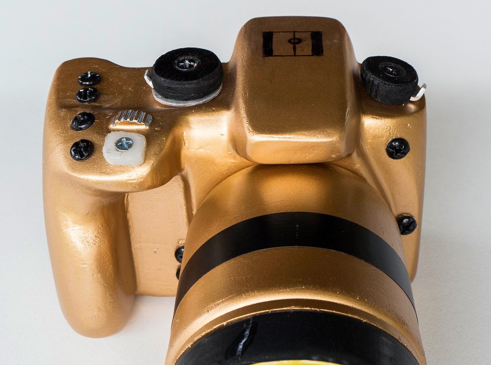
This mockup is the same size as the Samsung above but has a larger inverted L shaped handle and quad control system on top. It is difficult to convey in photos but this feels more secure and substantial than the Samsung above. 


Please follow my reasoning I propose that the basic ready to operate hold position should approximate closely to the half closed relaxed hand posture which I have been discussing in recent posts. This position is stable and strong yet relaxed. In this position the distal pad of the right index finger will lie naturally on the shutter button. There is substantial separation between the thumb and index finger but very little separation between the index and third fingers. The index finger spends most of it's time on the shutter button with brief excursions to the control dial and other nearby UIM's. It is preferable therefore to locate the shutter button forward and the control dial behind the shutter button. It is also desirable to place the top of the shutter button and the top of the control dial at the same height relative to the pad of the index finger as it moves side to side on a forward tilted plane from one to the other. The optimum distance between the two is the minimum distance which will prevent accidental activation of either. In my work with mockups I have found the optimum distance between the center of the shutter button and the centerline of the control dial to be 12-13mm. The optimum orientation of the control dial is that which follows the line of movement of the right index finger. This means the attitude of the dial will usually be tilted in two planes. The shutter button and control dial both sit about 4mm elevated from the top deck so the index finger clears the two buttons which make up the quad control group. Read more about this in a post coming soon.

When the reader looks at photos of my mockups, you might think that the buttons and dials are just placed in approximate positions. In fact I adjust and re adjust the shape of the body and handle and the precise location of all the buttons and dials in 3 dimensions until they are in exactly the optimum positions. A single millimeter here or there makes a significant difference.

Conclusion Photographers mostly become accustomed to the camera which they own. Even if it has suboptimal ergonomics users find workarounds for most operations. They will often declare that they "like" their chosen camera and may reject a different one even if it has in fact a much better user interface. I suspect the usual reason for this is change fatigue. I am suffering from this myself at the moment. Our family has just bought a Microsoft Surface Pro 2 and we are struggling to adapt to the new UI. I am sure that in due course it will prove itself but the learning curve is steep.

Photographers may initially reject the control dial position which I advocate if they are unaccustomed to it. In the long run however a camera with optimal ergonomics will be more enjoyable to use than one which is not quite right.

Rabu, 09 April 2014

Handles


This is my mockup of a full featured medium sized camera. It is, purely by chance the same width and height as the Sony RX10 below. This photo shows the inverted L shaped handle and associated top deck quad control UIM's. This camera is  very comfortable and secure to hold without strain.
 

The vast majority of cameras on the market are intended to be hand held devices.  It is reasonable therefore  to expect that every camera would be designed for optimal holding.  Unfortunately that is not the case. Human hands differ in size, length/width ratio and thickness but reasonably healthy ones all have the same functional anatomy.  In other words  they all work the same way.

A camera with a properly designed handle  is much easier to hold securely than one without a handle, particularly with a long and/or heavy  lens mounted.

If you handle various actual cameras  on the market today you might be excused for thinking that they have been designed for use by several different species of creature, so great is the shape variation between them.  I was provoked into starting this blog as a result of my experience with several camera models the handles of which appeared to conform to no human hand at all.

So I started making mockups  and thinking about the real, working cameras which passed through my hands.

Handle variants    For the sake of ordered discussion I like to recognise six basic types. There are intermediates and variants of course.

* No handle  My venerable Pentax Spotmatic and millions of similar mid 20th Century cameras used this variant.  I suspect they lacked a handle because of limitations on manufacturing  compound shapes in the metals of which all such cameras were constructed.  Compared to a well designed modern camera with an anatomical handle I find the Spotmatic awkward to hold and use, in part because of the missing handle.

Many modern compacts have no handle, possible because they are so light the makers deem one unnecessary.   However  I notice there is a demand for aftermarket handles for modern compacts, suggesting the designers may not have understood their customers' needs very well.

* Mini  Far too many cameras are afflicted with this blight on the ergonomic landscape. I bought one a little while back.  (Olympus EM5)  I could not hold the thing securely without gripping it tightly and then it was uncomfortable. The maker was happy to sell me a screw on accessory handle for another $200. With this fitted I could hold it with reasonable comfort but there were now two shutter buttons and three control dials on top of the camera.  Why did they not simply incorporate the handle in the first place ?  The subsequent model (EM1) got a proper handle but the next model (EM10) did not.  What was all that about ??

* Projecting    This has been standard issue on most SLR's and DSLR's since the Canon T90 of 1984.  It usually permits a decent grip on the camera but many models put the shutter button front and center on top of the handle. This is usually not where the index finger wants to find the button and leads to an uncomfortable holding/operating posture of the right hand, with the index finger pulled back from the position which it wants to find.
Photo courtesy of Digital Photography Review  dpreview.com
This is the Sony RX10. You can see that the shutter button is close to the right extremity of the camera forcing the index finger out and away from the camera. In addition the thumb support is also on the extreme right forcing the upper palm away from the camera.

Photo courtesy of Digital Photography Review  dpreview.com
Another view of the Sony RX10. If this camera had the inverted L style of handle the shutter button could be located in the vicinity of the black X. This would greatly improve the index finger position and allow for an improved layout of UIM's on the top deck.  This camera would also benefit from a more oblique thumb support as discussed in the next post.

 
* Parallel   This is less often seen than the projecting type possibly because it uses more camera width. The Sony NEX series (now called Alpha)  have a variant of the parallel handle.

* Oblique   This type of handle is required when the shutter button is located in the top/rear position referred to in a previous post. In this situation the right third finger has to lay in a curve along the front face of the body, very much as it would with a no handle design.
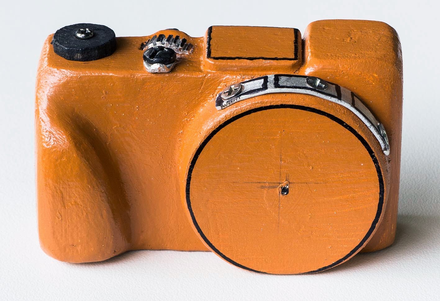
Mockup compact camera. This one is the same width as and only 2mm taller than a Sony RX100 (II) to allow for the inbuilt EVF. The oblique type handle improves the holding and operating experience.

Holding the mockup compact. You can see how the middle finger wraps around the oblique handle. The relationship between the hand and camera here is completely different from that seen in the photo below.

 
* Inverted L shape   After much experiment using mockups with projecting and parallel types I have settled on this as the most comfortable, providing the best support for the camera with minimal muscle effort, the most natural position of the right index finger on the shutter button (provided the shutter button is in the right place, of course)   and the best platform for user interface modules (UIM's). This type also uses minimal camera width.  The Canon EOS 100D (Rebel SL1) uses this handle style.
Holding the medium sized full featured mockup.  The hand and fingers wrap naturally around the body and handle because the mockup was designed to fit the hand, not the other way about. The overhanging top part of the handle allows the middle finger to support the weight of the camera without strain. The upper surface of the top of the handle provides a platform for the quad control UIM system which I will describe fully in a subsequent post. The shutter button is in the optimal place because I put the finger there first then shaped the upper handle and  located the button to fit. Users with smaller hands find a good fit by moving their hand upwards on the handle. Those with larger hands adopt a lower  hand position. The handle is designed to incorporate these requirements.
 
Summary  If cameras are to find ongoing favour with current and potential users they need to provide a distinctly different and more satisfying user experience than smart phones. One aspect of that experience is holding and a vital part of the ergonomics of holding is the handle.  I take the view that every camera should have a handle contoured to fit the user's hand and fingers. Even compacts can benefit from a carefully sculpted small handle. 

My practical research leads me to the view that the optimum holding and operating experience for a full featured small or medium camera is provided by the inverted L style of handle.

Many modern cameras feature handles which are not optimally designed.  They would be greatly improved by the fitment of a more anatomical handle (and associated UIM's).  Good design costs no more than suboptimal design.


Selasa, 08 April 2014

Traditional or modern control layout Part 2 Worked examples

Toilet as architecture
 
In the following comparisons, I will use two cameras, the Panasonic GH3 representing the Modern layout and the Fuji X-T1 representing the hybrid/traditional layout.

Heading the previous post is a photo of a small kestrel in flight. At the moment this little raptor glided over my head I had been about to make landscape photos with a telephoto zoom lens. The camera was set to Aperture Priority Mode. My Task was to switch from Aperture Priority auto exposure to Shutter Priority auto exposure and set a shutter speed of 1/1000 sec, which my previous experience had informed me is about right for birds in flight. Completion of the task requires actions.

Panasonic GH3
 
GH3: With this camera I was able to carry out the required actions while continuing to look through the viewfinder. The actions are

* Shift grip with right hand to apply right thumb and index finger to the Mode Dial.

* Turn Mode Dial one notch from A to S. See confirmation of setting in viewfinder. I had previously set the shutter speed to 1/1000 sec so this was automatically recalled.

* Return right hand to normal operating position and take the picture.

Fuji X-T1. Photo courtesy of Digital Photography Review  dpreview.com
Some people have said they really like this camera but as Michael Reichmann said on his Luminous Landscape site "be careful what you wish for". 


X-T1: I guess with a lot of practice an experienced user might be able to perform the required actions while looking through the viewfinder but I suspect most will lower the camera so they can see what they are doing. Actions required depend on the lens mounted. The Fuji X lens system is a bit complicated. Some lenses (mostly primes) have a clicking aperture ring with marked stops, some (generally variable aperture zooms) have an aperture ring with no marked stops and a third type (budget models) have no aperture ring at all. Let's assume we have a variable aperture zoom with an aperture ring. The required actions are:

* Release grip on the camera/lens with the left hand.

* With the left hand, locate the little slider switch on the upper left side (as viewed by the user) of the lens barrel and move this to the red A position.

* Take the weight of the camera/lens with the left hand, shift grip with the right hand and move the right index finger and thumb onto the Shutter Speed Dial.

* Turn the dial off the red A position around to 1/1000 position.

* Return the right hand to normal operating position.

* Return the camera to eye level and take the picture.

Comment You can see that the GH3 completes this task with less actions, most of which are less complex and with fewer support actions being required.

Here is another task example: Change ISO setting.

GH3: The required actions can be carried out while looking through the viewfinder and without having to shift grip with either hand.

* Move the right index finger back from the shutter button onto the ISO button (with a little practice the ISO button is easily distinguished from the buttons on either side). Press the ISO button.

* Change ISO setting with either the front or rear control dial (depending on user selected function settings for the dials)

* Take the photo.

X-T1: It might be possible for the experienced user to complete the required actions while looking through the viewfinder but I suspect most will prefer to lower the camera to see the ISO dial.

* Release grip on the camera/lens with the left hand.

* Grip the ISO dial with the index finger and thumb of the left hand and turn the dial to the required setting.

* Return left hand to the normal holding position.

* Take the photo.

Comment Again you can see the modern UI allows the task to be completed with less actions, most of them less complex, with fewer support actions required.

I could go on for ages detailing the actions required to complete each and every task of operating the camera but I suspect this would become tedious. The same result comes up every time. I think the point is made.

Conclusion A well designed modern UI allows the user to carry out the tasks of operating a camera more quickly and efficiently than is possible with a hybrid traditional UI.

By the way.... The Fuji X-T1 is one of the more coherently designed cameras with hybrid traditional UI. Some are much worse to the point of being ergonomically chaotic. Check out the Nikon Df.................This thing is like an ergonomic train wreck with miscellaneous cluttered user interface modules scattered about incoherently. Some have functions which operate at odds with others. Very strange...............

Traditional or modern control layout Part 1 Discussion

Kestrel. Panasonic GH3, 100-300mm lens. I was getting ready to make some long distance landscapes with the Mode Dial on A (perture priority). This kestrel hove into view so while continuing to look through the viewfinder, I quickly flicked the dial to S (hutter priority) which was pre set to 1/1000 sec and made 5 quick shots in the 3 or 4 seconds the bird was within range.
Nostalgia vs Efficiency ?
For a large part of the 20th Century if you had an SLR or rangefinder it came with the traditional suite of controls because there was no alternative. Cameras were mechanical. The means by which shutter speed, aperture and focus were achieved were all mechanical and the settings all visible from above the camera. In due course cameras acquired more and more electronic functions. Aperture and shutter speed repeater readouts appeared in the viewfinder. Aperture Priority then Shutter Priority Auto exposure became possible. Around the turn of the century control of auto exposure capabilities was consolidated to a single (set and see) Mode Dial with adjustments made by a mode dependent control dial. This is the basis of the modern control system which still dominates the world of DSLR's and most MILC's.

The retro phenomenon Over the last few years we have seen several new camera models released with some variant of the traditional control system, always as a hybrid with the designers trying to blend traditional and electronic controls in the one device. My work with ergonomics leads me to the view that the retro phenomenon is actually retrograde and leads to a less efficient user experience than a well designed fully modern control layout can provide.

Basic features of the traditional user interface All the user interface modules (UIM's) are of set and see type. This means what it says. The dial or lens ring has marked settings which are selected directly. An example of an all manual 1960's/70's traditional camera is the Pentax Spotmatic shown in the photo.

Advantages of the traditional UI

* Settings for primary and in some cases secondary exposure and focus parameters can be set and are visible from above the camera, without needing to turn it on and without needing to look through the viewfinder or monitor or LCD panel.

* Some users have expressed in user forums a preference for setting and viewing exposure and focus parameters on set and see dials as they say it forces them to think more carefully about their "firing solution" (ISO/Shutter Speed/Aperture) than is the case with a modern UI using a Mode Dial and Control Dial.

* Some users say they "like" the style, appearance or idea of a traditional camera. I say beware the pervasive influence of "likes", any one of which is likely to be idiosyncratic and temporary.

Disadvantages of the traditional UI

* In Capture Phase of use, when one is looking through the viewfinder, all those set and see dials are invisible. But Capture Phase is precisely when you most need to see readouts for primary and secondary exposure and focus parameters. So the makers have to provide repeater readouts for all that camera data in the viewfinder.

* So now we have a key camera data set appearing in two places. But there is a considerable opportunity cost to this. A set and see UIM can only be used for one data set. If the module is used for, say, ISO setting, it cannot be used for anything else. My ergonomic studies have led me to realise than set and see UIM's are actually most useful for Prepare Phase adjustments to the most frequently used Modes. Individual preferences vary but these would I think usually be

* Focus Mode (AFS/AFC/MF)

* Autofocus Mode (On Panasonic cameras, Face detect/Tracking/1-Area/23-Area/Pinpoint)

* Drive Mode (On Panasonic cameras, Single shot/Burst/AE Bracketing/Timer delay)

So these should have highest priority for location on camera top set and see dials. But if primary exposure parameters are on those dials the modes have to be bumped off to a Q Menu or in some cases to sub levers beneath the top dials. This can make the top deck a very busy place, not easy to read or operate manually.

* Without a Main Mode Dial you cannot have a Novice's (point and shoot) mode or Custom modes.

* There is no direct access to P,A,S, auto exposure or Manual exposure settings.

* My time and motion studies of the actions required to operate the camera in Capture Phase show that in most cases the traditional UI requires more actions each of greater complexity than is the case with a modern style UI.


Advantages of the modern UI
* Permits a cleaner layout with less UIMs required than the traditional style.

* Permits direct access to capture modes including a novice (point and shoot) mode and custom modes.

* Gives direct access to the P,A,S, auto exposure modes and manual exposure mode.

* Almost all actions required to operate the camera are carried out with fewer, less complex movements of the fingers and hands and fewer associated movements are required to enable the primary movements.

* There can be more space on the camera for UIMs the function of which can be user set. Fewer UIM's have only one function. This allows each user to effectively design their own interface.


Disadvantages of the modern UI
* I really can't think of any. The operator cannot see readouts for aperture, shutter speed and ISO without looking in the viewfinder or monitor but I don't see that as a disadvantage. That is where and when you need to see that particular data.

* Some people have expressed the idea that the modern camera looks like a lump of plastic without a "soul". Maybe it doesn't look retro chic funky cool. The top deck is not loaded with "real metal" dials. So what I say, it works better.


Next: Worked examples


Senin, 07 April 2014

Shutter button location

Coastal Scene. Panasonic GH3 with 12-35mm f2.8 lens.
 
Location of the shutter button is of crucial importance to the overall functional design of a camera.

There are basically two options,

1. Shutter button rearward, located on top of the camera body. This is the classic traditional camera location, used by millions of film SLR's and rangefinders throughout the mid part of the 20th century. There has been a recent and in my view ergonomically retrograde trend for new camera designs to reprise this shutter button position.

2. Shutter button forward, located on the handle. This has been the standard SLR/DSLR shutter button position since the Canon T90 of 1984.

Why it matters The shutter button is universally operated by the pad of the distal phalanx of the right index finger. Therefore, obviously, the index finger has to go where the shutter button is located and the rest of the hand is connected to the index finger and also to all the other fingers so the position of the shutter button directly controls the possible positions of the right hand and all the fingers. This has major ergonomic and functional consequences.

Functional anatomy Human hands vary in length, width and thickness but reasonably healthy ones all work the same way. The starting point is the half closed relaxed posture as shown in the photo. In this position the hand is ready for action. Hardly any muscle effort at all is required to take up this position. A well designed camera should have a handle and body shape and shutter button position which:

* Allows the right hand to adopt the half closed relaxed posture while holding the camera ready for action. The hand is ready for action and so is the camera.

* Allows the index finger will fall naturally onto the shutter button without strain.

* Locates high value user interface modules (UIM's, buttons, dials etc) adjacent to the shutter button such that they can be operated using the index finger without having to move any other finger. Most cameras fail to meet this requirement, which is disappointing as it is actually quite easy to achieve with good design.
This is the approximate position of the hand and fingers holding a camera with top/rear shutter button position. It's not the worst thing in the world and young people with  flexible joints might be happy with it. But compared to the grip below this one is less natural and comfortable and provides less options for operating user interface modules other than the shutter button. 


Hand position with top/rear located shutter button The photo illustrates the position which the right hand must adopt when holding a camera with rearward shutter button position. You will notice this is not the half closed relaxed position. The index and third fingers have been pulled apart into an unrelaxed, joint stretching position.


Benefits of a well designed shutter button forward position
* Relaxed yet strong basic hand/finger posture.

* Shutter button can be (but in actual camera is often not) located exactly where the index finger wants to find it.

* Handle can be designed to wrap over the third finger so the camera can be supported without the need to tense gripping muscles.

* Allows UIM's, particularly a control dial adjacent to the shutter button to be reached and activated by the index finger with no movement by any other finger.

* Right side neck strap lug fits between index finger and thumb, does not intrude on holding.
This is the half closed relaxed posture. A camera with forward shutter button can be designed so it fits into this hand/finger position (not the other way around) This is more relaxed, comfortable and strong than the position above. The index finger has more freedom of movement to operate UIM's other than the shutter button.


Disadvantages of shutter button forward position

I can't think of any. You do need a handle on which to locate the button but that is an ergonomic advantage not a disadvantage.

Benefits of shutter button top/rear position

I can't think of any. Really. None. Old style 20th Century cameras had the shutter button there because it connected mechanically with a mechanism beneath the button. Manufacturing technologies of the day did not permit a different location. Today the connections inside the camera are electronic and the shutter button could literally be anywhere on or off (remote release) the body. I have no idea why the makers of some new cameras stick the shutter button on top of the body. Nostalgia ?? Reprise the good old days ?? ???


Disadvantages of the top/rear shutter button position
* A full ergonomic handle cannot be incorporated into the design. Only a reduced handle can be fitted due to the position of the fingers. This cannot incorporate an overhang beneath which the third finger could fit. In consequence the right hand has to grip the camera by force of muscle. If the hand relaxes the camera will fall immediately.

* It is difficult to find an appropriate location for a front control dial. Cameras with top/rear shutter button and a front dial usually position the dial on the front face of the body, beneath the shutter button. But in that position it cannot be operated by the index finger without shifting grip with all the fingers of the right hand. Some makers locate the dial like a collar around the shutter button. This is more accessible but captures all the real estate around the shutter button leaving no space for other high value UIM's.

* The basic hold position with top/rear shutter button is less comfortable than that used with a well designed forward shutter button position.

* On many cameras which I have used the right side strap lug manages to dig itself into some part of my right hand, usually the pad over the base of the index finger. In addition there is no clear space where the strap itself can drape while the camera is in Capture Phase.

Shutter button position on the mockups The process by which I make mockups involves shaping the camera and all it's parts to conform to my hands and fingers. I work on the body, handle and thumb support until the resulting shape feels comfortable in my hands. I do not draw the shape. I start with blocks of roughly cut wood then cut, file sand and often fill them until the shape is right. Then after that I put the shutter button exactly where my index finger wants to find it. On none of the full featured cameras did the shutter button end up in the top/rear position. My only mockup with top/rear shutter button is the compact. In that case constraints of the very small size forced the shutter button onto the top of the body. A very small mini handle is fitted. This works but is not as comfortable as the larger models.

Summary There is no functional or ergonomic rationale for the top/rear shutter button position on any camera larger than a small compact.

Recent cameras with top/rear shutter button location The Nikon Df, all the Fuji X-Cams, Sony A7/R, Panasonic GX7, Olympus Pens, EM5/10 all have the top/rear shutter button location and they all have ergonomic problems as a result. It is my carefully considered and researched view that all these cameras are headed backwards ergonomically. In my view one of the few things Canon has gotten right in recent times is a steadfast commitment to the shutter forward configuration on it's DSLR's. Of course I think many of those DSLR's should be MILC's but that is another story.


Minggu, 06 April 2014

Hump top or Flat top ?

 
I posted a piece on this recently. Here is a summary :

Holding You would not think that the two would be any different to hold. Indeed if both are fitted with a full anatomical handle there is no difference. However all the actual flat top cameras in my experience also have the shutter button in rearward position, on top of the body. This makes provision of a full handle impossible. I will discuss this further in the next post. So considering actual cameras in production, hump tops with full handles are more comfortable and secure to hold.
Both mockups are the same size. On the left the flat top, on the right the hump top. Even with it's decent anatomical handle the flat top has less real estate for stuff. The inbuilt flash and EVF are squeezed into the same horizontal space. There is room only for one set and see dial.


Viewing Flat tops have the viewfinder top left. Humptops have the viewfinder on the lens axis, closer to the midline of the camera. For right eye viewers one might think the flat top would be preferable. In practice however, with actual cameras, I have not found this to be necessarily the case. I am a natural left eye viewer but have trained myself to use the right eye so I can appreciate the requirements of both. With the Panasonic GX7 and Fuji X-E1 I found myself squinting more than I would with any hump top camera. This was due to stray light entering the viewfinder area to a significantly greater extent than occurs with hump tops.

With left eye viewing both types can be awkward, in both landscape or portrait orientation.

Overall I find a slight advantage to the hump top provided the viewfinder eyepiece extends rearward from the face of the monitor by about 15mm, no less, so one does not have to twist the head sideways to see in the viewfinder.

Even in a medium size the hump top has more space for stuff.  The flat top on the right is wider than the hump top because it has a parallel handle. Even so the hump top has more space available. I squeezed two set and see dials onto the flat top but I suspect that would be a bit tight in practice. On the hump top I opted for two user configurable buttons in that location which gives more control to the user about which functions can be controlled from the camera top.

Operating The main difference between the two is the amount of real estate available on top of the body for user interface modules, EVF, hotshoe and built in flash. The hump top locates the EVF, hotshoe and built in flash fore and aft in a line. This frees up space on either side of the hump for set and see dials and other UI modules, be they dials or buttons. Some flat tops fit the built in flash in front of the EVF but this is possible only if both are small.

Some users may find an advantage in having the viewfinder on the lens axis particularly in portrait orientation where the hump top provides a more balanced hold/view position. Some users might also find the hump top hold/view position more secure and balanced with long lenses which require a high level of stability.

On balance I give this to the hump top, by a small margin, even when the viewfinder is electronic and could be located anywhere.

Basic Design Decisions

 
Since the advent of the smartphone camera sales have fallen heavily. Compacts have been affected most but DSLR's and MILC's are also down, at least to the end of 2013. It seems to me that if the camera as a separate device is to survive and flourish it needs to present a very different user experience from the smart phone.

The smart phone is

* largely automatic in operation. It does not engage the user much in the process of making pictures.

* Held out in front of the operator who previews the picture on the monitor.

* Not fitted with a real optical zoom lens.

* Uses touch screen controls not a comprehensive set of hard user controls.

The Proper Camera needs to provide a far more engaging experience for the user. It needs

* An anatomical handle and thumb support

* A built in EVF

* Fully articulating monitor

* Long range zoom lens (or the capacity to mount one)

* Fast, responsive performance

* Comprehensive set of hard (dials, levers. buttons) control modules suitable for the expert or enthusiast user.

* Ability to shoot RAW files

It should also have good enough picture quality although many cameras and some smart phones already have this. What I am driving at here is that the key difference between the proper camera and the smartphone lies in the level of engagement of the user. Picture quality differences are secondary in my view.

Touch screens, Wi -Fi Many cameras these days seem to be trying to offer the user features which are characteristic of smart phones. One of these is touch screens which I have found to be useless on a hand held camera with eye level viewing. I posted a detailed piece about this in June 2013. Another is Wi-Fi connection to a smart phone which could be useful as a means of remote control for the camera but less useful as a conduit for uploading files due to the large size and proprietary characteristic of many RAW files.

Fixed lens or interchangeable (ILC) My ergonomic analysis is equally applicable to cameras with fixed or interchangeable lenses. With improvements in the imaging capability of small sensors I would not be surprised if one day superzoom types supplant interchangeable lens types.

DSLR or MILC DSLR's have been undisputed rulers of the serious camera realm for many years but I believe that MILC's will become dominant in due course. I got fed up with the inaccurate focussing, overweight, oversize lenses and clunky user interface of DSLR's years ago. So my ILC's are now mirrorless and most of my ergonomic work now concentrates on MILC's.