In October 2013 I posted an analysis and commentary on the ergonomics of the Sony A7 camera.
You can jump to it here.
I said that the designers needed to “redesign the entire upper handle and top deck of this camera”.
I explained why and described exactly what changes would make the A7 more ergonomically effective.
The A7(2) is the fourth iteration of the A7 theme, previous models being the A7, A7R, and A7S.
Sony appears to have been listening to users and reviewers who commented adversely about the control layout of the original design.
For the A7(2) the Sony designers did indeed redesign the entire upper handle and top deck.
 |
| Hand position when holding the original A7 with index finger on the shutter button. The fingers do not take this configuration naturally. |
The result is certainly moving in the right direction ergonomically although I think further improvements could be made.
The front dial is still not quite positioned optimally in relation to the shutter button. It needs to be higher, so it is at the same height as the shutter button and angled more upright so the right index finger can locate and operate it more naturally.
 |
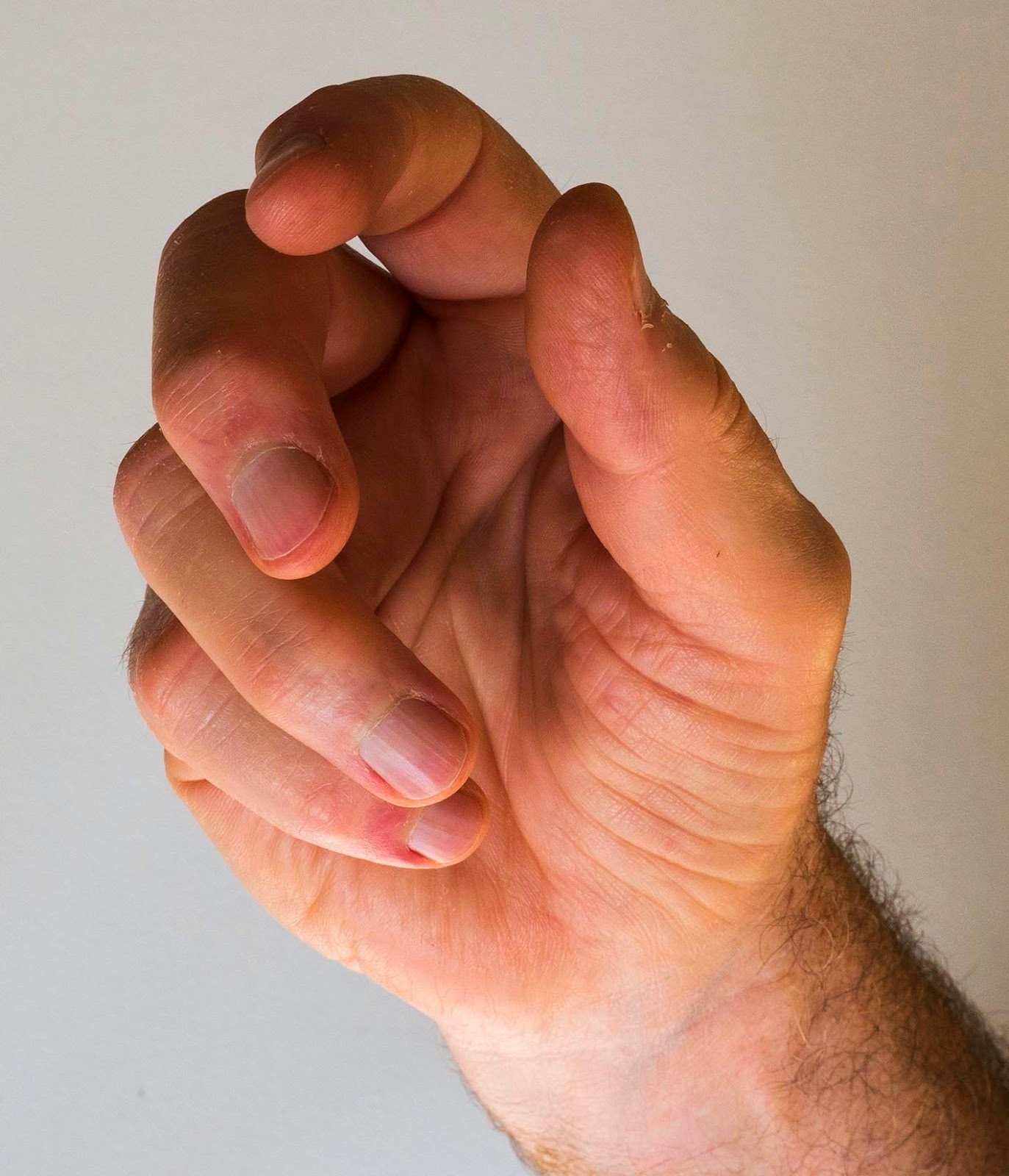
| Optimal hand/finger position when holding a camera. This is the relaxed, half closed position. The A7(2) allows the hand to come closer to the desirable position. |
In addition the thumb support and rear dial are not optimally positioned. An arrangement which places the thumb at a greater angle across the back of the camera provides a stronger grip with less effort and allows the rear dial to be reached and operated more easily. The Panasonic FZ1000 (with minor caveats) is an exemplar for best practice in thumb support and rear dial design.
If Sony moved the lens axis a few millimetres to the left (as viewed by the operator) this would make room on the right side for a larger and more ergonomically shaped handle. Other Sony cameras do have the lens axis further over to the left.
I note there are still many sharp edges at the junction between the body and top plate. Presumably this is somebody’s idea of modern styling but the hands which use these cameras remain obstinately free of such angular shapes.
My summary: Sony is moving its A7 series in the right direction ergonomically but still has quite a way to go.
Sony’s approach to camera ergonomics still seems quite inconsistent to me. Given that the hands which use cameras are all the same why is, for instance, the A77 such a different shape from the A7 ?
I take the view that Sony (and other makers) would serve their customers better if they paid more attention to ergonomic design and were less concerned by “styling” aspects of the shape.


Tidak ada komentar:
Posting Komentar